The much-anticipated unveiling of Winthrop University’s new logo occurred on Thursday, Feb. 22 at 11:00 a.m.
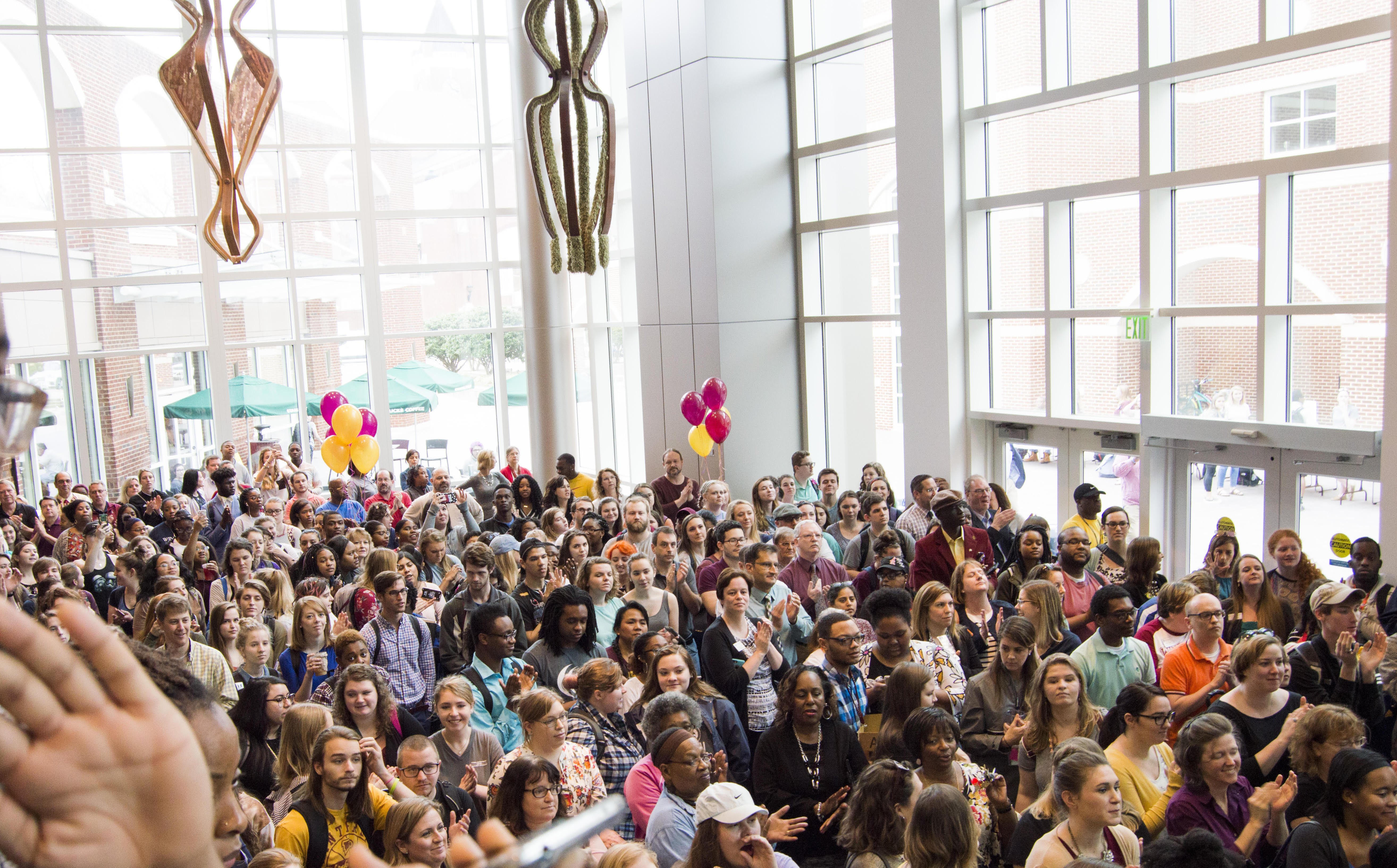
Students rallied to the first floor of the Digiorgio Campus Center this morning in excitement for the reveal of Winthrop University’s new logo. After waiting in anticipation, at 11:15 a.m. on Thursday, Jeff Perez, the Vice President of University Relations, went on stage and spoke to the crowd that had gathered. He then introduced the university’s President, Dan Mahony., who took Perez’ place on stage.
Mahony spoke of the former logo and the many different kinds of logos that Winthrop had used in the past, describing them to represent as many good qualities of the school, but very separate ideas that made them seem disconnected from one other. Mahony explained that the new logo would bring a sense of unity to all of Winthrop’s ideals, by while still encapsulating a symbol that sets apart the university and its students from any other school: the eagle.
“When you use the eagle… the eagle statue, even other places that are eagles don’t have that eagle statue so that makes a difference, nobody is going to copy that. No one is going to have the exact same thing,” Mahony said.
Winthrop University partnered with FMB Advertising, a private company that specializes in things like logo design, in order to come up with the new face of Winthrop. They produced several different polls to students, faculty, and alumni, in order to fine tune the logo they wanted to produce in order for everyone to enjoy it.
“It really came from what we heard from folks on and off campus about what they wanted to capture in terms of the history of the school but also looking forward. So we went about trying to capture, with our creative partner FMB, what would do that. That’s how we identified the shield from the seal, and the eagle from right here on campus,” Perez said.
“This logo went through several iterations: we created something, we went back and talked to folks, did a redesign, did that a couple of times before we came up with the final logo, so we’re so excited that people are responding so very positively,” Perez continued.
It is unknown how long the entire rebranding process will take on campus, but the overall opinion of the new logo has been overwhelmingly positive.
“I think the new logo is the perfect mix of old and new. The incorporation of well-known symbols, like the font and shield from the seal, is a great way to display the rich history of our university,” said Nolan Worthy, a sophomore Computer Science major.
“I love the logo. From the unique eagle head to the inclusion of the original Winthrop font, I think it perfectly captures the essence of our university; holding onto tradition, but moving forward,” said Jennie Montgomery, a senior English major.
Many students were concerned about the price of the logo and whether it would have an effect on tuition or not. Katie Price, the Director of Marketing for Winthrop, stressed that the endeavor was cheap and would not affect student tuition.
“Any time you do a big undertaking like this, it’s going to cost some money, but it’s really important because it definitely is supportive of our Winthrop Plan which a big part of is to grow enrollment… But really we’ve done it in the most fiscally responsible way and most fiscally conservative way that we are able to do it,” Price said.
The university’s new logo costs $154,000 to do the research, design the logo, and rebrand the entire website. There is also an additional $20,000 specifically for rebranding the physical emblems around campus.


